Reiner Communities
Building one credible corporate brand and a repeatable identity system for the communities behind it.
Industry
Affordable housing / multifamily housing
Engagement
Brand, website, and property identity system
Relationship
Defined project, delivered and handed off
Status
Brand foundation and property systems delivered
Scope
Corporate logo, brand strategy, market research, website content, website design and development, community logos, property signage, photo post-production, marketing materials, apparel, business cards, and community-facing materials
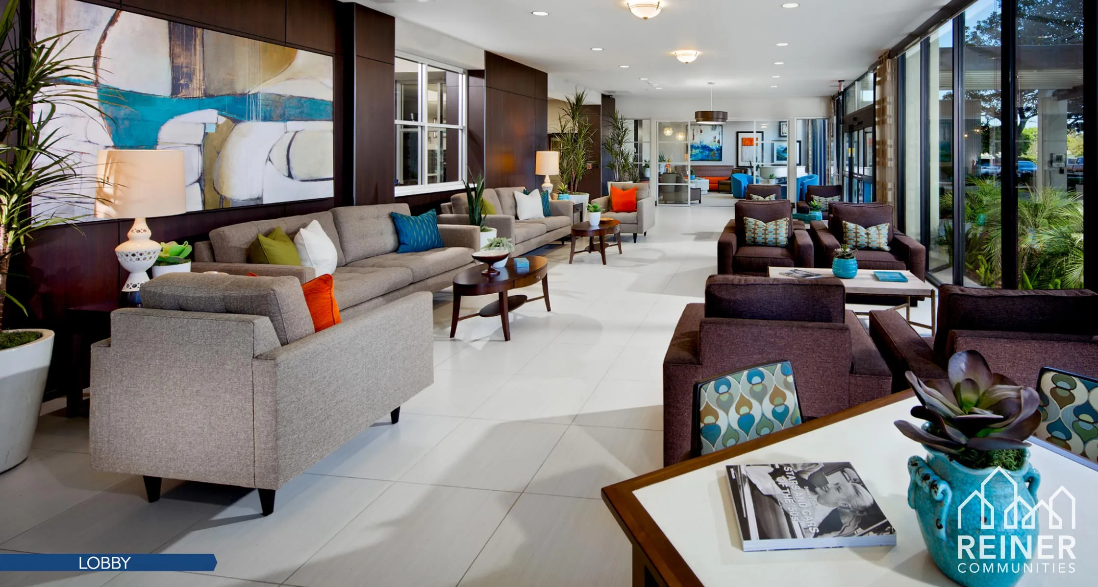
The company needed one credible brand. The communities needed room to feel distinct.
Reiner Communities worked across affordable housing, property renovation, resident communication, and long-term community stewardship. The public-facing challenge was to earn credibility with partners and institutional audiences without making the company or its housing communities feel generic, cold, or defined only by financing.
Keeks built a corporate identity and a repeatable property-level system around that need. The work connected positioning, company branding, community identities, signage, website content, property photography, and physical materials so the organization and the places residents call home could feel related without feeling identical.
Reiner retained ownership of housing operations, development, renovation, resident relationships, property decisions, and community stewardship. Keeks built the brand, website, identity, signage, photography, and communication system around them.
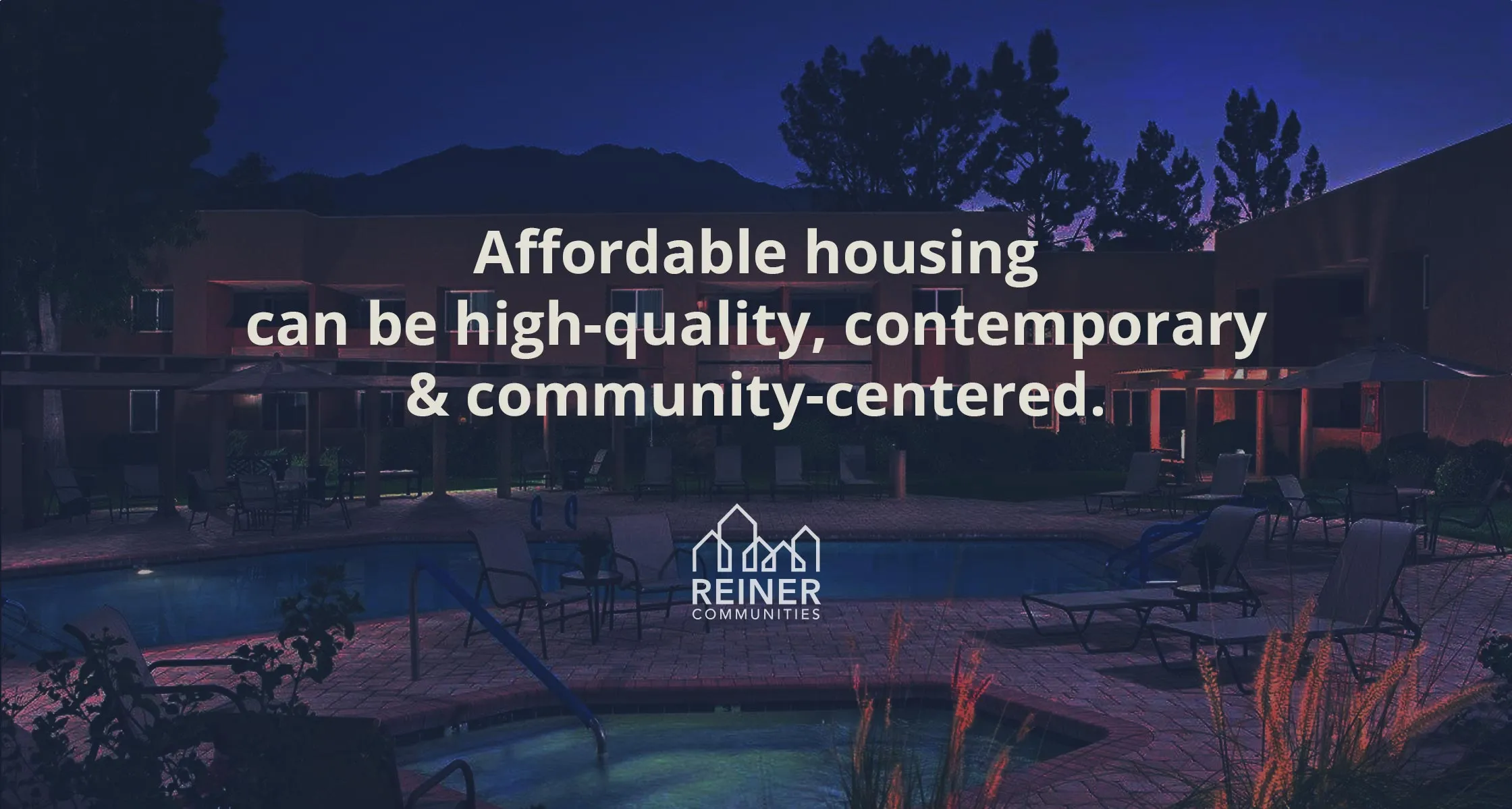
One connected project, expanding from corporate identity into every community.
Four stages show how a corporate brand grew into community identities, signage, a website, and a physical rollout system. Each stage built on the one before it.
- 01Affordable-housing missionA company preserving, improving, and creating quality multifamily communities.
- 02Corporate identityCompany logo, positioning, messaging, credibility, and public presence.
- 03Community identities and placeProperty logos, signage, photography, and community-level applications.
- 04Connected rollout systemWebsite, property presentation, marketing materials, apparel, business cards, and organized assets.
The company had to feel established without feeling institutional.
Reiner operates in a category that involves housing policy, financing programs, acquisition, renovation, resident communication, and long-term property stewardship. The corporate identity needed to feel credible to institutional audiences while still reflecting the human purpose behind the work.
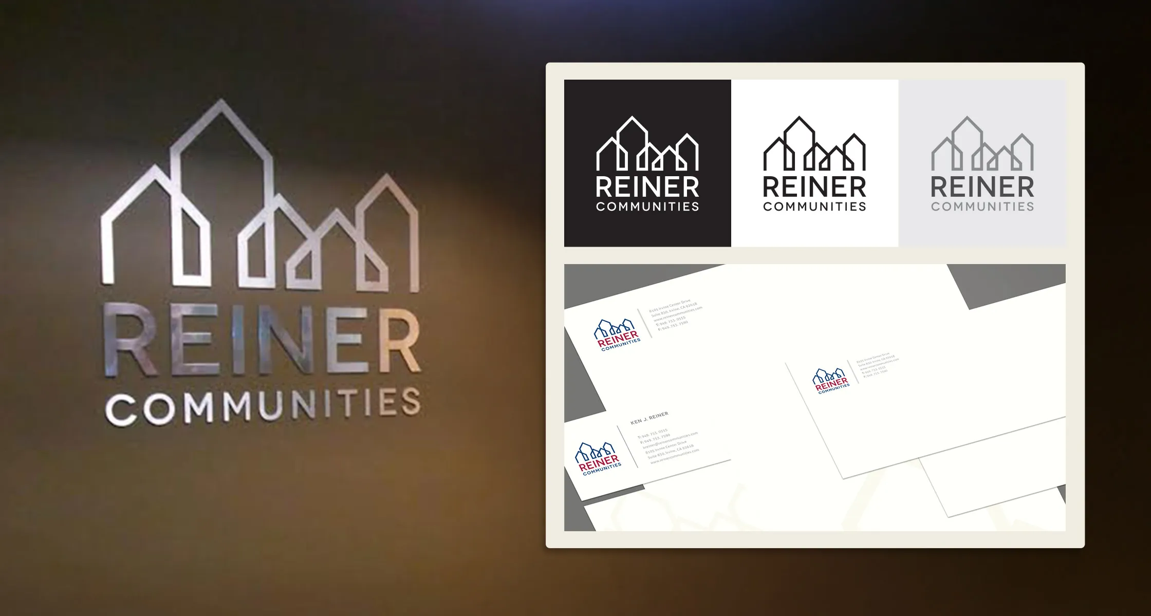
Keeks created the corporate logo, visual identity, positioning, messaging, and brand system around that balance. The company-level brand became the foundation for the website, business materials, apparel, community identities, signage, and public communication.
Each property needed its own sense of place.
The housing communities could not feel like anonymous extensions of one corporate template. For residents, visitors, partners, and neighbors, names, logos, signage, and property presentation all shape whether a place feels cared for, current, and connected to its surroundings.
Keeks created community-level identities and signage direction that allowed individual properties to feel distinct while remaining connected to Reiner Communities. The system carried the corporate standard into the built environment without making every location look the same.
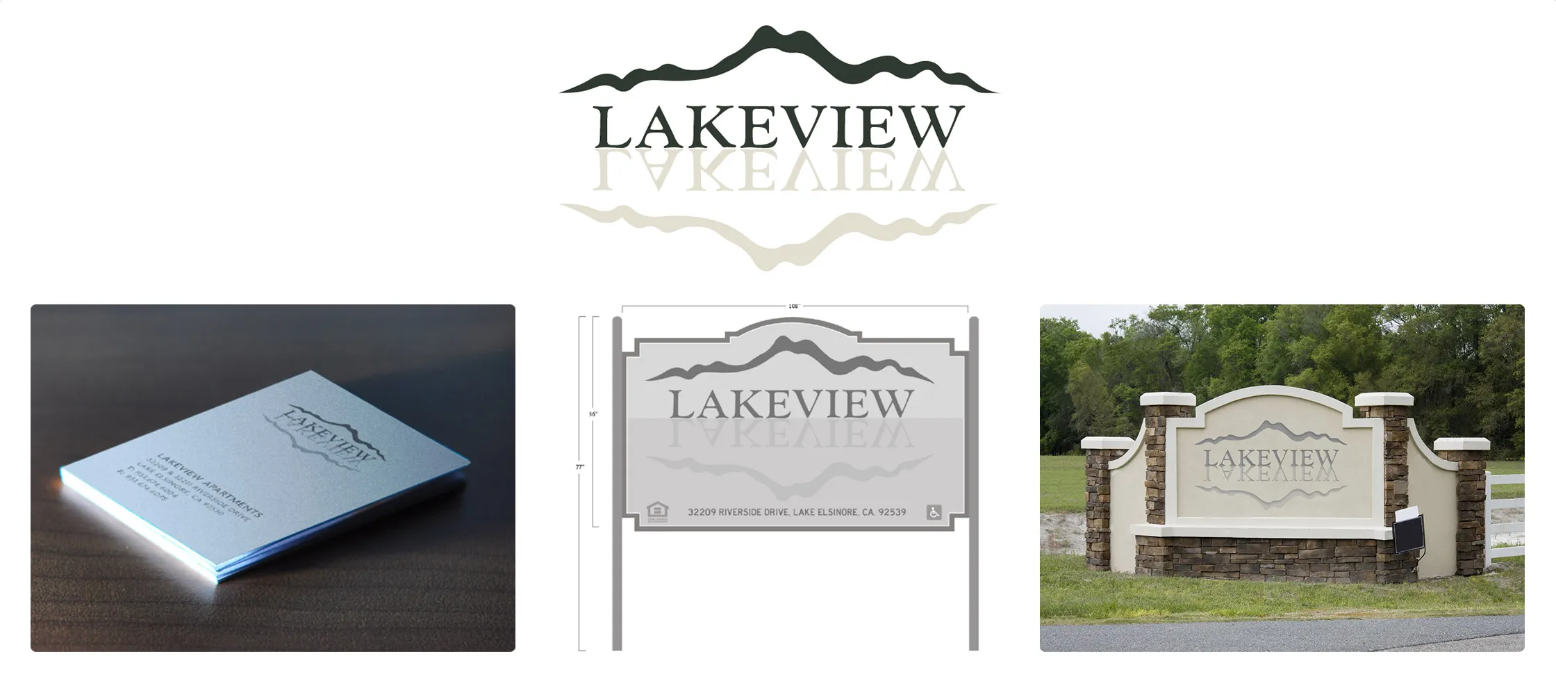
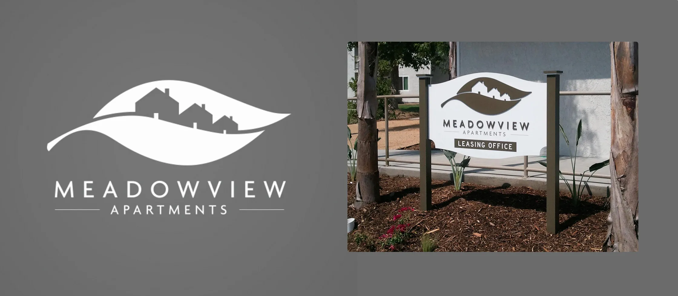
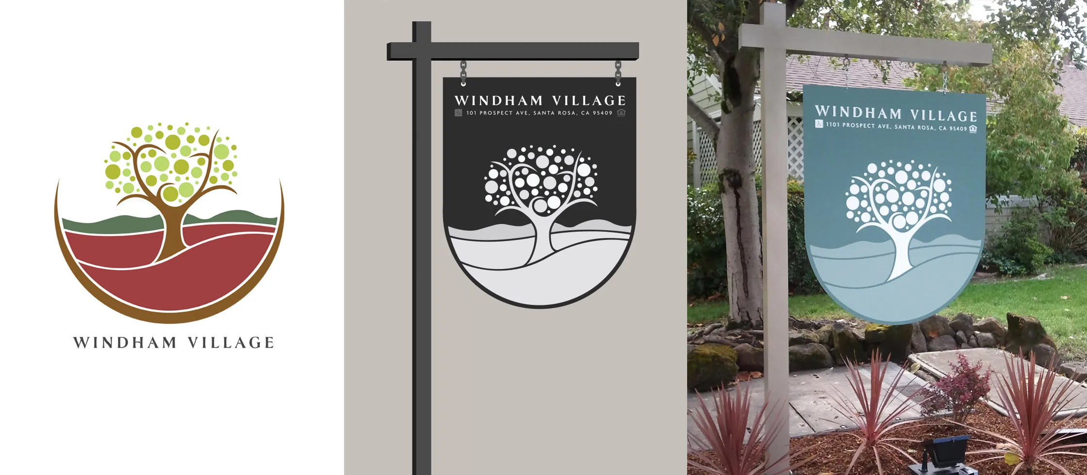
The website had to explain the company and show the communities.
The website needed to serve several audiences at once. Partners and stakeholders needed to understand the company, its experience, and its approach to affordable housing. Residents and community audiences needed to see quality, care, professionalism, and the places behind the work.
Keeks organized and wrote the content, designed the interface, developed the website, and prepared the property imagery around that job. The result was a clearer explanation layer for the company, its communities, its renovation work, and its long-term role in affordable multifamily housing.
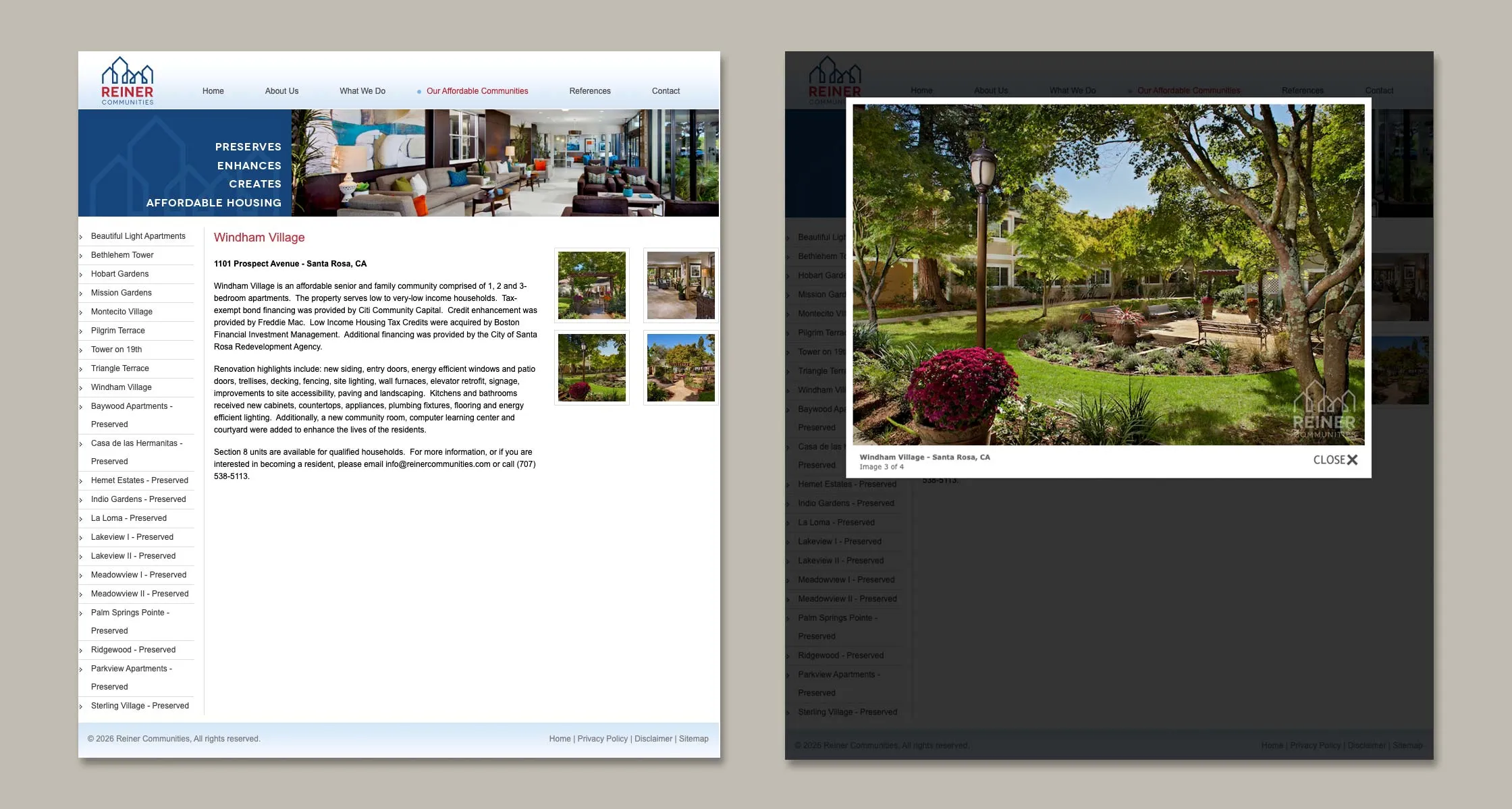
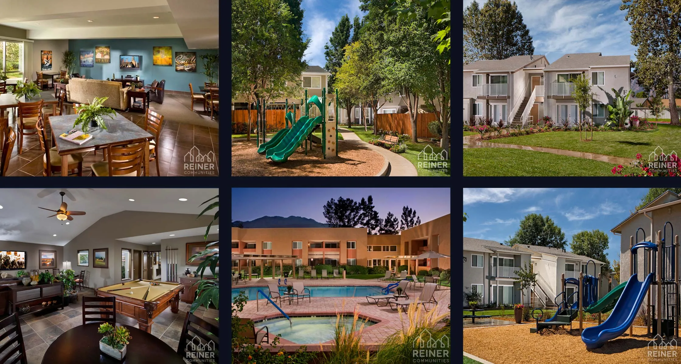
The system had to work across every property touchpoint.
The brand needed to continue beyond the corporate website. Marketing materials, business cards, apparel, signage files, property collateral, photography, and community-facing materials all needed to carry the same standard.
One company, many places, one standard.
Reiner arrived needing credibility at the company level and distinctiveness at the community level, without one undermining the other. It left with both: a corporate brand institutional audiences can trust, and a repeatable identity system each property makes its own. The engagement was a defined project, and it ended as one. Keeks built the system. The communities operate under it.