Greystone TCP
From a difficult logo constraint to a complete professional training brand, website, and course-material system.
Industry
Professional training / specialized tactical training
Engagement
Project-based brand, website, and marketing-materials build
Relationship
Defined project, delivered and handed off
Status
Project complete; brand and website launched
Scope
Brand strategy, market research, logo design, identity, website copy, website design and development, course communication, marketing materials, apparel, business cards, course folders, and participant materials

The request was narrow. The design problem was not.
Greystone came to Keeks with a focused assignment: create a logo that could live inside a rectangular obelisk and represent growth in knowledge, ability, discipline, and confidence. The identity needed to feel serious and credible without relying on crosshairs, shields, flags, or other familiar tactical symbols.
That constraint became the starting point for a larger system: once the mark was established, the company needed positioning, a website, course communication, and the printed and physical materials that carry a training brand into the room.
Greystone retained ownership of the training methodology, instruction, course decisions, and operational expertise. Keeks built the brand, website, communication, and participant-facing system around them.
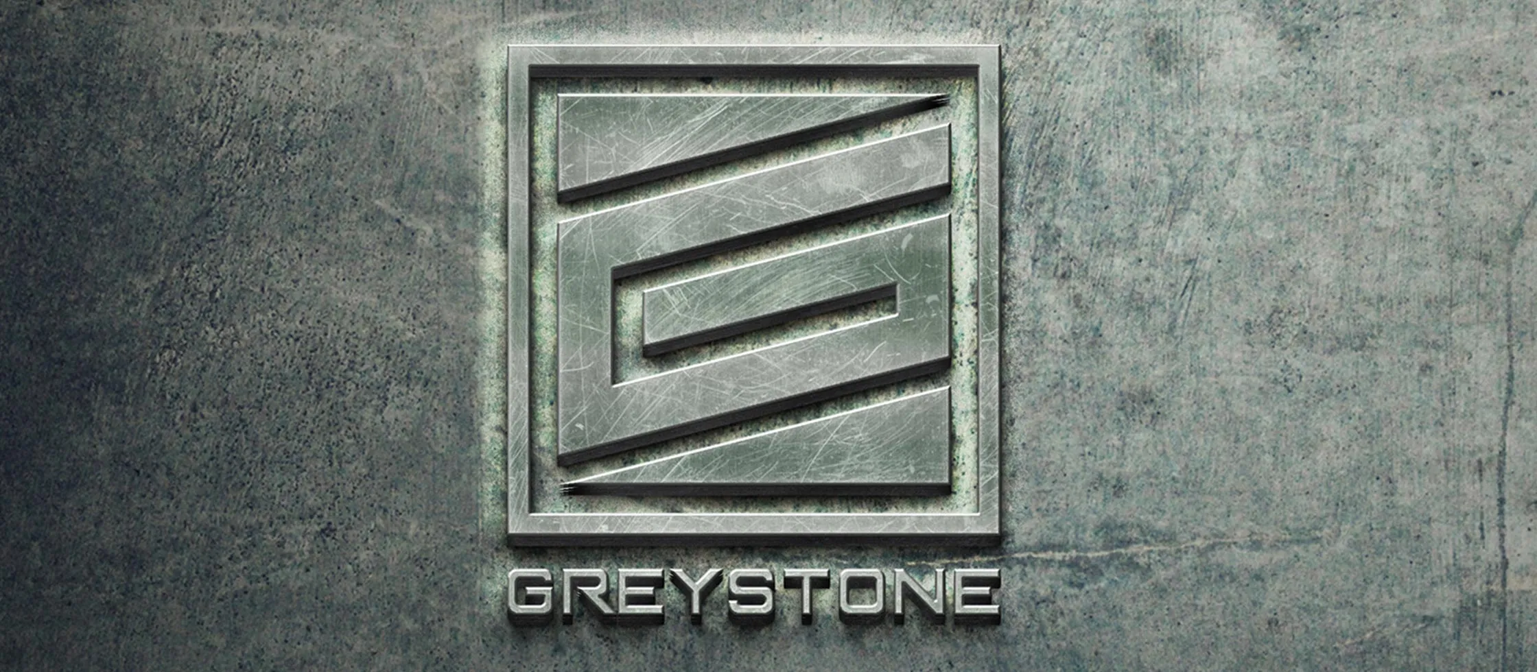
One defined project, expanding from one focused request.
Four stages show how a single logo assignment became a connected identity, website, and participant-facing system. Each stage built on the one before it.
- 01Logo constraintA mark built inside a rectangular obelisk, representing knowledge and ability without tactical cliches.
- 02Brand and positioningStrategy, research, identity, messaging, credibility, and audience direction.
- 03Website and course communicationCompany story, instructor credibility, course organization, leadership, and contact paths.
- 04Participant-facing systemCourse folders, printed materials, apparel, business cards, marketing collateral, and final asset handoff.
The identity had to feel disciplined without becoming predictable.
Greystone operates in a category where visual language can become generic quickly. The brand needed to communicate expertise, structure, and confidence without leaning on theatrical aggression or familiar military shorthand.
Keeks developed the logo, identity direction, visual system, positioning, and credibility messaging around that balance. The mark became a usable system across the website, business cards, apparel, printed materials, and the physical course experience.

Specialized expertise had to become clear and navigable.
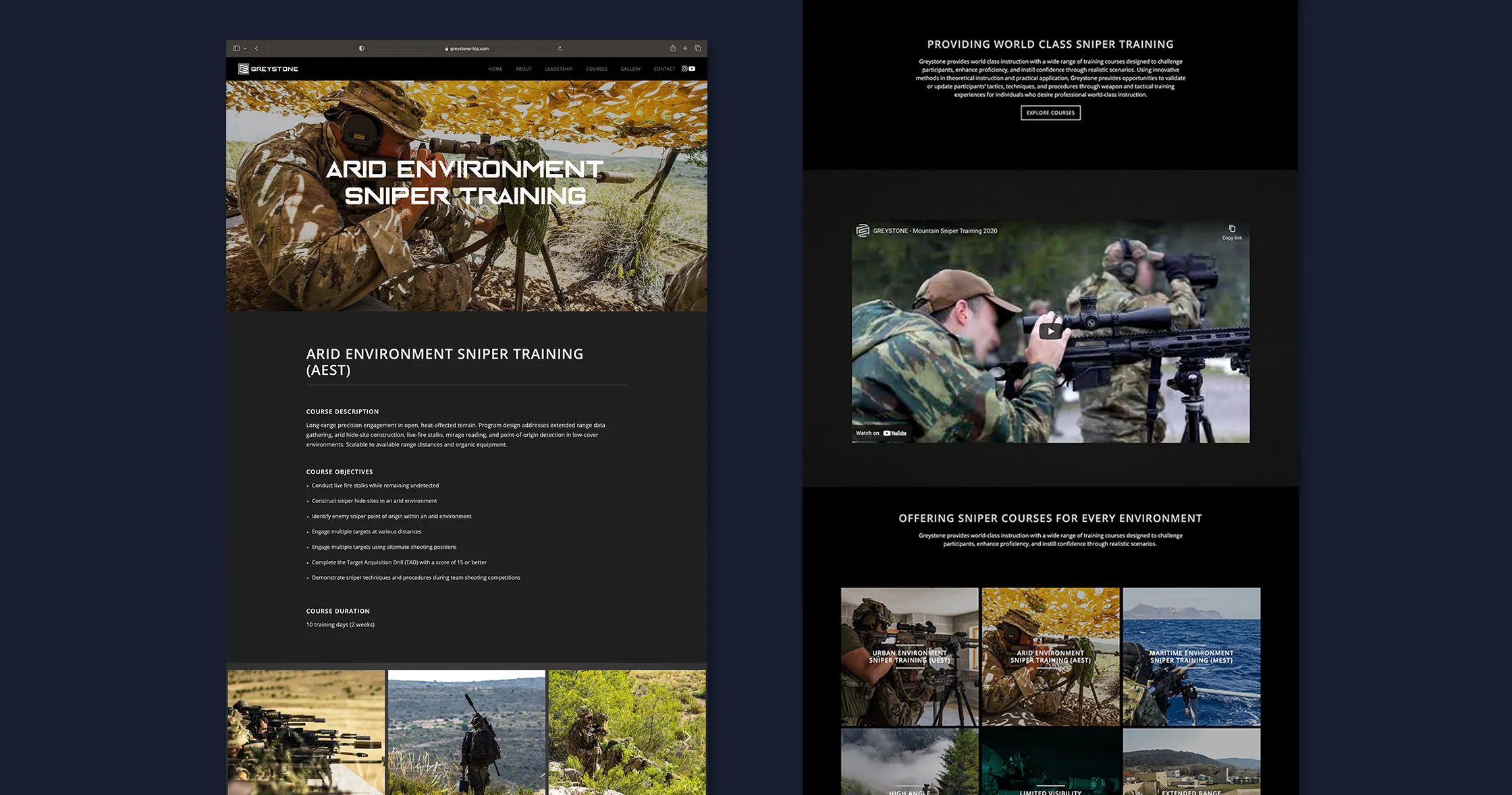
The website needed to introduce the company, establish instructor and leadership credibility, organize the course offer, explain the training environments, and give prospective participants or organizations a clear path to contact the team.
Keeks wrote the website content, designed the interface, and developed the digital experience around that job. The structure gave Greystone a professional public presence for the company story, course pages, leadership, international experience, and contact pathways.
The brand had to continue after someone arrived.
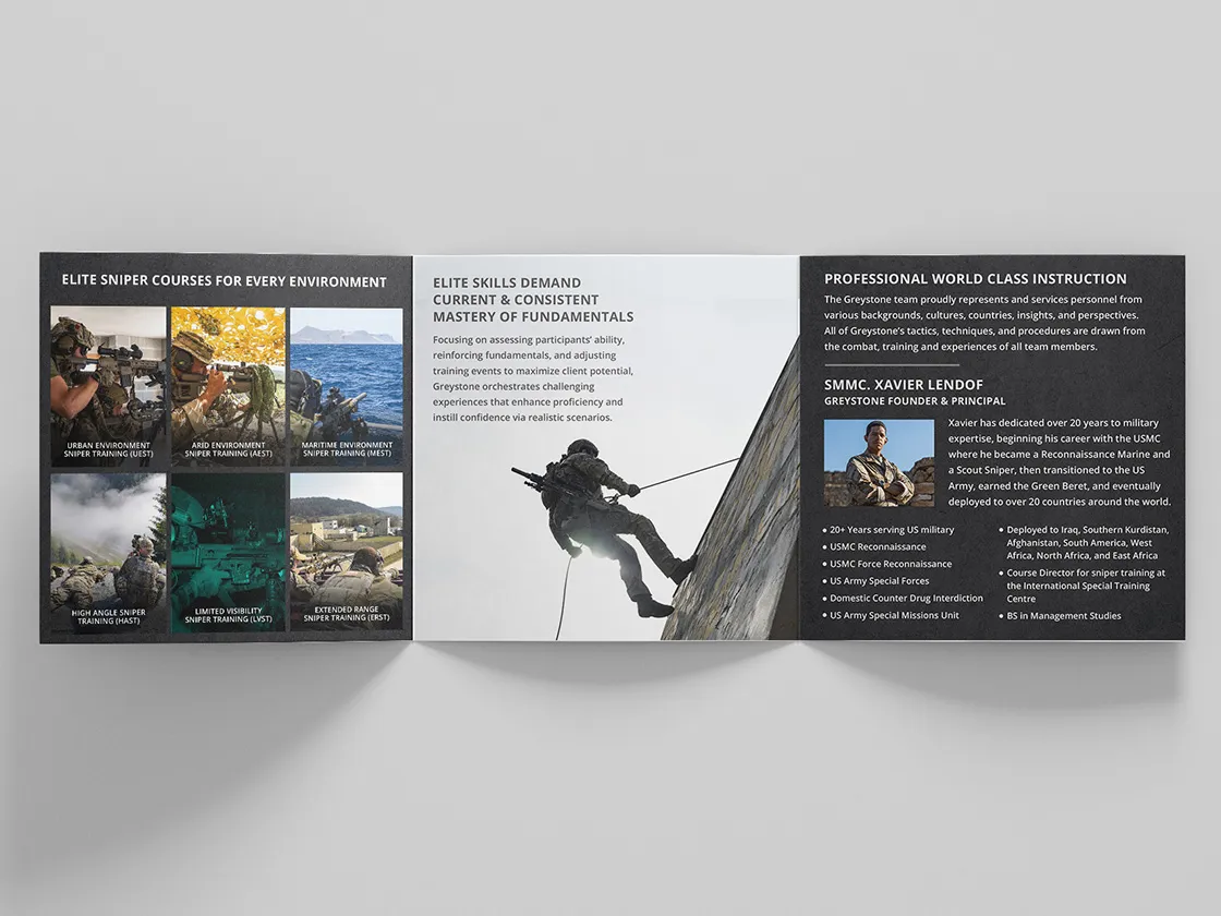
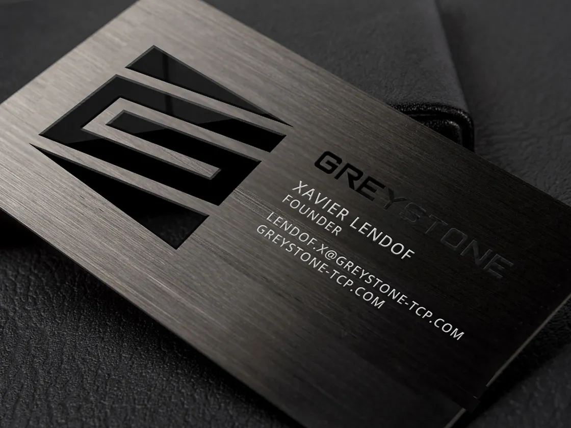
Greystone did not exist only on a website. Participants encountered the company through course folders, handouts, apparel, business cards, printed materials, and the physical items provided during the training experience.
Keeks created those materials and applications, so the identity a participant met on the website was the same one handed to them at the course.

One constraint. One connected system.
Greystone arrived with one difficult logo assignment and left with a complete brand: identity, website, course communication, print, apparel, and participant materials, all holding one standard. The engagement was a defined project, and it ended as one. Keeks delivered the system. Greystone runs the training.